As a student in India, Kushagra Agarwal’s favorite subject had always been art, until he started having difficulty identifying the color brown. By sixth grade, dark green, red, and brown became almost indistinguishable to him.
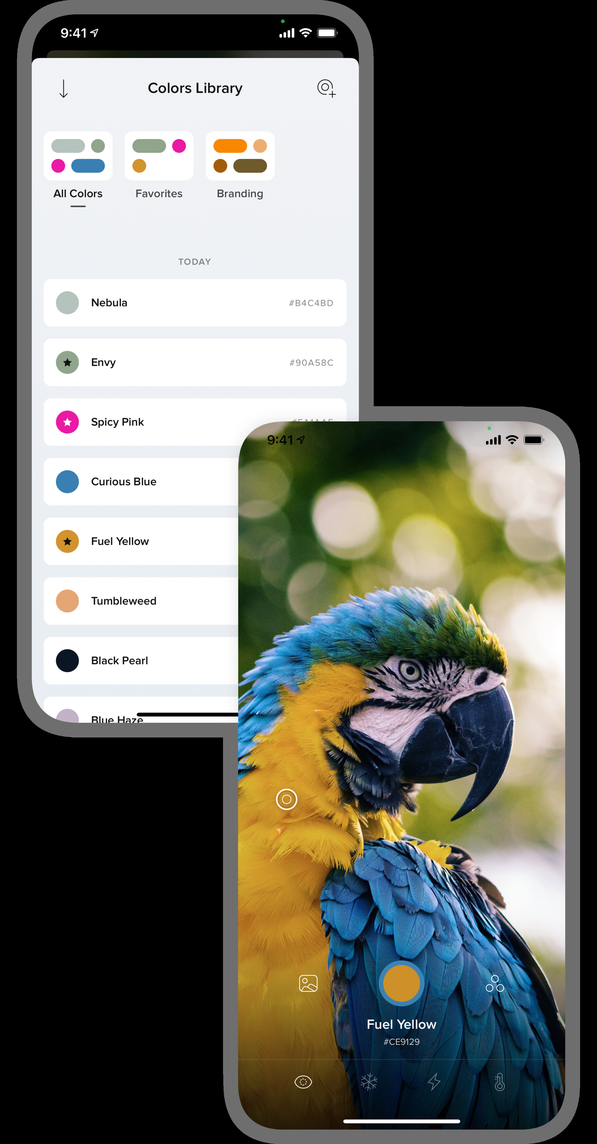
As he grew older, Agarwal was disappointed by the lack of tools for people with color-blindness, so he got to work: Coding with Swift, he built the app Cone, which uses the iPhone or iPad’s camera—and Apple’s AVFoundation framework—to identify colors in photos or any environment.

Agarwal designed *Cone* to serve as a guide for those with color-blindness.
The App Store spoke to Agarwal about color temperatures, the design world, and picking ripe mangoes.
What inspired you to create Cone? There were other options for color-blind people, but they never worked reliably for me. Some would read only limited hues. Some would read only the color of the exact pixel you were pointing to, which would result in inaccuracies. Individual pixels never tell the whole story—the colors you see, especially in high-resolution photos, are an average of all the colors in a small area.
When did you realize you were onto something? I’d heard it’s possible to tell if a mango is ripe by its color. I could never do that because I have a hard time differentiating between yellow-orange and green. So one day I had the app look at a few mangoes in the kitchen and found some of them were green! To my eyes, they were different shades of the same color, but Cone told me the real story. I still use Cone to identify ripe mangoes!
What was the early response to your app? Initially, people—mostly from Reddit’s r/colorblind community—were skeptical about Cone’s accuracy, mainly because of two problems in existing apps: inaccurate color readings in different lighting conditions and the tendency for apps to read only a single pixel value. I introduced a color-temperature control so Cone could read colors accurately in different lighting conditions. I also had Cone read every color around a point and show the average result. People enjoyed this attention to detail.
How has Cone evolved since launch? Before Cone was released to the public, it was a simple color-identification tool for personal use. Once I started polishing it for release, I figured out another use case that would help me as a designer: the ability to store and manage colors in a library. So over time, Cone evolved to be a utility for designers. It’s now used by UI designers, interior designers, graphic designers, print designers, and more.
The app has become an invaluable tool for many people. What has it meant for you? Now I make fewer mistakes seeing colors, so I am able to always wear matching clothes!
Powered by WPeMatico
