
Ready to show off your pixel perfect design skills? We’re challenging you to embrace the constraints of a grid and design an app icon at pixel level using only black and white colors. When we design icons today, we create work for high-resolution HDR screens, with millions of pixels and color at our disposal. But there’s joy in embracing a bit of retro restraint: pixel grids can help you distill the essence of your design and make sure your icon is clear and understandable at all sizes.
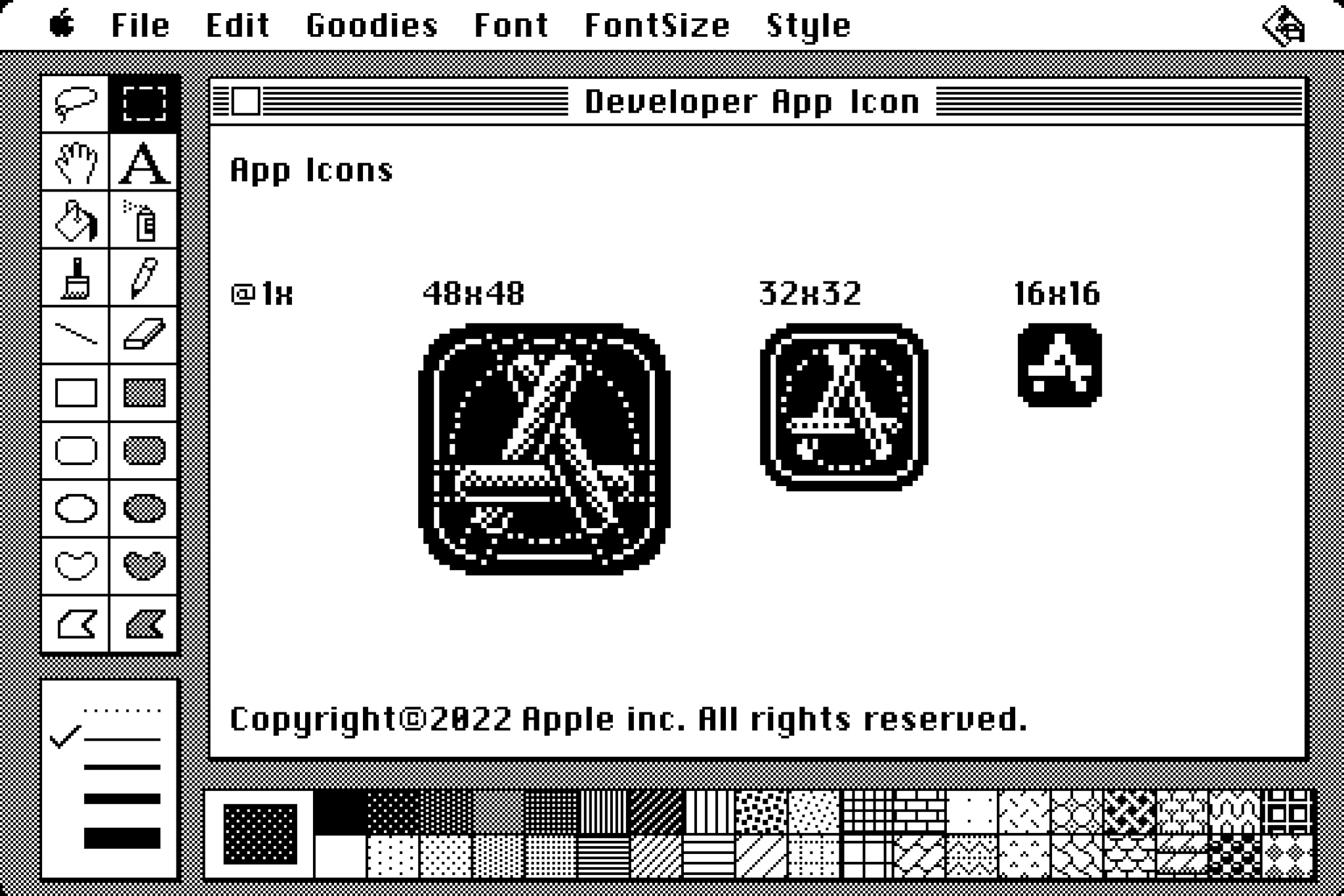
Challenge yourself to embrace constraints and design an app icon using only black and white colors on a 48×48 pixel grid.
Pixel icons have a rich history on the Mac. MacPaint was a raster graphics editor released as part of the original Macintosh in 1984, and its icons were playful, simple and recognizable to people around the world. Many of the defining icons for modern drawing and design tools – such as the paint brush, lasso, and hand tool – were originally created for MacPaint by Susan Kare, one of the original designers for the Mac.
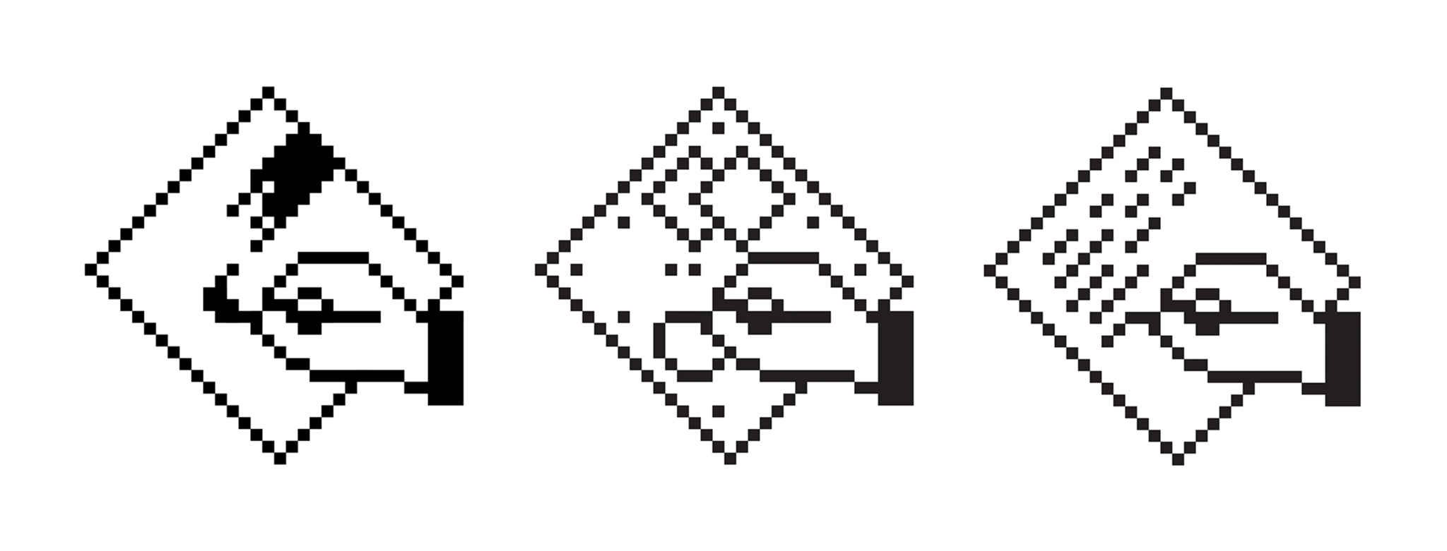
App icons for MacPaint, MacDraw, and MacWrite, originally created by Mac designer Susan Kare.
Kare designed these icons with the monochromatic limits of the first Mac display in mind, using a grid-lined notebook to map out each pixel. While we’re no longer limited by hardware, you can explore those same design principles to help you create fun, interesting, and visually stunning icons.
Begin the challenge
We’re inviting you to create an app icon at pixel level using only black and white colors on a 48×48 pixel, 32×32 pixel, or 16×16 pixel canvas. You may design for every size, for two sizes, or just one size. You can draw your icon on paper or using your favorite program; we’ve also provided a pixel grid for download.
Download a pixel grid for the challenge
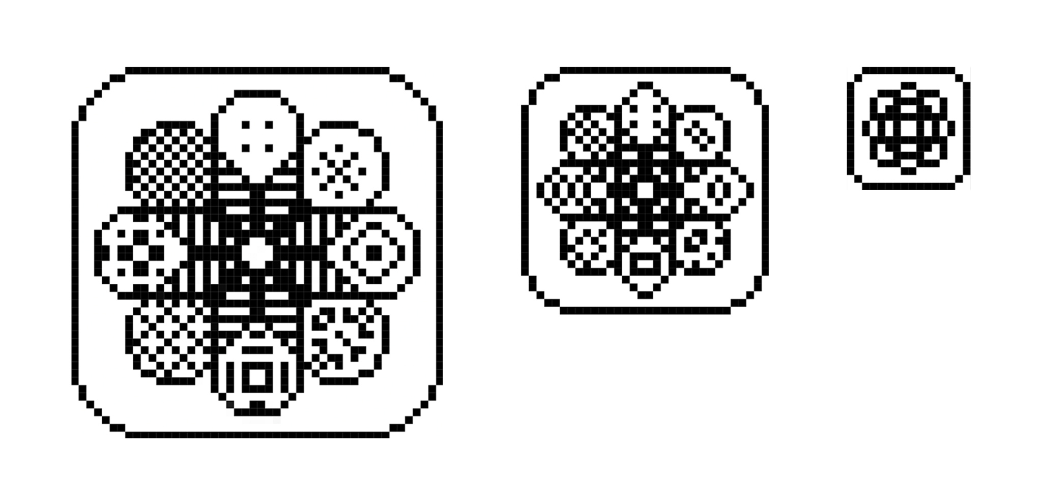
- Before you start drawing on the canvas, think about your goal: Are you designing a brand new app icon, or recreating something that already exists?
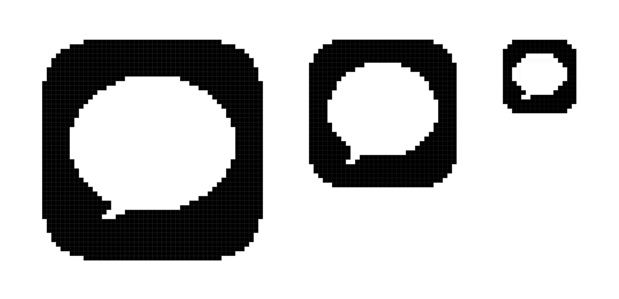
- Once you’ve decided, explore a single element that captures the essence of the app, and express that element in a simple, unique shape. For example, the Mail app icon uses an envelope, which is universally associated with mail.
- Add details cautiously. If the content or shape is overly complex, details can be hard to discern. Icons at all three sizes should generally match in appearance, although you can explore subtle, richer, or more detailed additions at 48×48 pixel size.
We welcome you to visit the Design Study Hall to collaborate on this challenge! Ask questions, connect with other developers, and share your creations — show us what you’ve made in the Digital Lounges or on Twitter with the hashtag #WWDC22Challenges. And if you’d like to explore more on design, join the team at events all throughout the week at WWDC22.
Powered by WPeMatico
